Ryan Stahl

Graphic & Web Designer

R
S
Map of My Projects
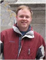
My name is Ryan Stahl and I have been designing graphics and websites for over 14 years. Within that time I’ve worked with small businesses as well as large Fortune 50 corporations.
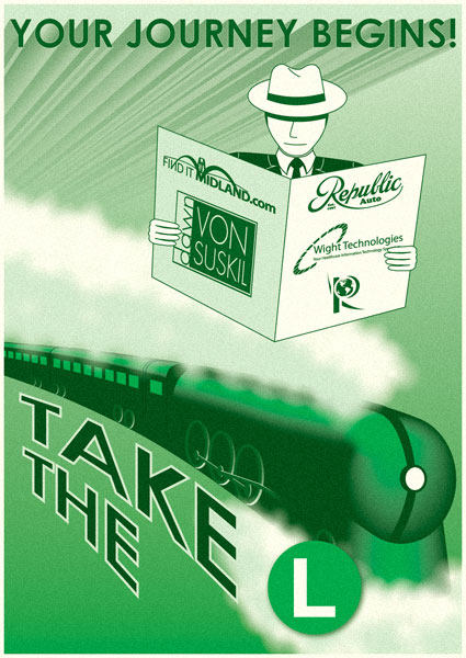
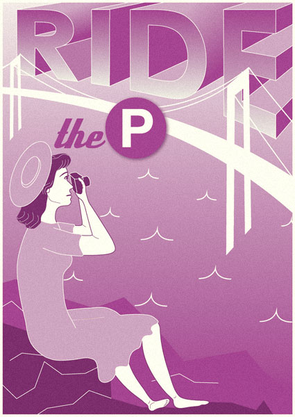
I chose to utilize an interactive transit map to show off my programming skills and to better convey some of my recent work, which covers many different design genres. Each line represents one of those genres. Each station name is a project.
Click on a station to view a project.
Map Legend
(A)
About Me
(M)
Maps
(W)
Websites
(I)
Infographics
(L)
Logos
(P)
Photography
(D)
Drawings
Map Key
Project Link
Project Link which
Covers Multiple Genres
Map Key
Created & Maintained by Ryan M. Stahl
Updated March 15, 2015
Pluralsight
(L)
(L)
(L)
Take the “L”
(D)
DRAWINGS
CLICK TO VIEW
Ride the “P”
(D)
DRAWINGS
CLICK TO VIEW
Road Map
(M)
MAPS
CLICK TO VIEW
Shepherd
(M)
MAPS
CLICK TO VIEW
Michigan
(P)
PHOTOGRAPHY
CLICK TO VIEW
Minnesota
(P)
PHOTOGRAPHY
CLICK TO VIEW
New Jersey
(P)
PHOTOGRAPHY
CLICK TO VIEW
New York
(P)
PHOTOGRAPHY
CLICK TO VIEW
Wisconsin
(P)
PHOTOGRAPHY
CLICK TO VIEW
Bio
(A)
ABOUT ME
CLICK TO VIEW
Business Card
(A)
ABOUT ME
CLICK TO VIEW
Facebook
(A)
ABOUT ME
CLICK TO VIEW
LinkedIn
(A)
ABOUT ME
CLICK TO VIEW
Résumé
(I)
INFOGRAPHICS
CLICK TO VIEW
Dawn von Suskil
(W)
WEBSITES
CLICK TO VIEW
Travel Website
(W)
WEBSITES
CLICK TO VIEW
Résumé
(I) A
This is an infographic résumé of sorts to show off my abilities in Adobe Photoshop. Every element in it was designed using the tools that come with the latest relese of the application.
Bio
(A) (M) (W) (I) (L) (P) (D)
Ryan Stahl
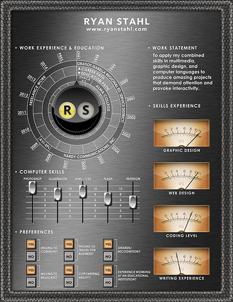
Ryan Stahl is an experienced graphic and web designer who is always looking for innovative ways to create attractive, user-friendly interfaces for multimedia solutions. As an early-adopter of HTML, he has been working with code in many languages, including JavaScript, for well over a decade.

Ryan attended Alma College, a private college located in Alma, in central Michigan. Here he took art classes on top of the required course load and developed his talent for design. During his time at the college, he was also an integral part in the creation of multimedia projects viewed by the public. Here he received his Bachelor of Arts degree in Communication.

He has completed works now utilized by large companies, such as Dow Chemical and Plante & Moran, as well as various local governments and non-profit organizations.

This site's design came about while brainstorming how a portfolio of projects could come together in an easy-to-navigate way. Combining his love of JavaScript and HTML programming, map-making and mass transit systems, the idea of using a transit map, that pays homage to the New York City Subway and London Underground, was conceived.

Also part of the design is this website's ability to expand as more projects are added to the portfolio. Many lines are labeled as under construction, making note that the addition of new project samples are imminent.

Thanks for stopping by!
Ryan M. Stahl
Business Card
(A)
This is a front and back representation of my current business card. Photos I took were edited in Adobe Photoshop. The card itself was designed in Adobe Illustrator. I used the same New York Subway theme that I am using for my web portfolio for consistency.
Wight Technologies
(L)
Designed for a company tasked with the job of transferring medical records from paper to digital, this is a freshening of their previous logo. It was created entirely in Adobe Illustrator.
FindItMidland
(L)
This logo was created for a client who was working on a search engine for local businesses in the Midland, Michigan area. The website has since been taken offline, but the logo lives on! It takes design cues from the Midland 'Tridge,' which is a local 3-span footbridge, and made in Adobe Illustrator.
Republic Auto
(L)
Calling upon a logo of a now-defunct truck manufacturer in Alma, Michigan, this logo was designed for a client running an auto repair shop. The client provided an old clipping with the logo and needed me to freshen it up in Adobe Illustrator as a vector graphic for signage at his establishment.
Classic ‘R’ Logo
(L)


This logo was designed to be utilized as global branding for my freelance services in graphics and web. It was featured anywhere from websites to business cards to letterhead. It hearkens to a retro era of design, somewhat reminiscent to the NASA 'meatball' logo. It was created in Adobe Illustrator and has been retired.

Unlike other Daytona series, Paul Newman is uniquely designed to replica watches uk show only the four-digit number at the earliest date, including Ref.6239,6241,6262,6263,6264 Or above 6265. There are rolex replica watches so-called "dice" in the small window, and the second window at the 9 o'clock is hublot replica marked with 15,30,45,60, which is different from the general "20", and part The model is not engraved with Daytona words, and this one is engraved on replica rolex Daytona, located at 6 o'clock on the small window above.

Dawn von Suskil (Logo)
(L) (W)
This logo was created for use in the website of the same name which is also featured on this website on the Websites line. Initial design was done in Illustrator, then the logo was imported into Photoshop to rasterize and add effects for web presence.
Dawn von Suskil Fine Art Website
(W) (L)
Created for an artist who wanted to market her paintings, this website incorporates characteristics of her art in every element within. The backgrounds feature close-ups of the paintings in great detail, revealing textures of paint and brush strokes.
Travel Website
(W) (P)
This is a recent website project, finished in early 2012 and created to showcase some of my photography. Each page reveals photography that I have done in a handful of states in the northeastern part of the United States. These states are also broken down as separate links on the P-line of this site's map.

This site features some use of Java Script programming to simplify navigation.
Shepherd
(M)
This map has been featured in Shepherd Maple Syrup Festival's annual brochure for 12 years. Shepherd is located in central Michigan. Constant changes to the map keep me involved with the project every April. It's always a nice way to begin the spring. The map was designed in Adobe Illustrator and converted to EPS and PDF to submit to the brochure printer.
Road Map
(M)
Developed as a background designed to repeat infinitely, this map was designed to look like a gas station road map from the late 1940s. Though never implemented, at least as of yet, this work demonstrates my ability to work between Adobe Illustrator (i.e. roads, rivers, symbols, and labels) and Photoshop (i.e. textured background).
Take the “L”
(D)
Designed as one of a series of posters for use in this website, each poster is or will be dedicated to each line on my projects map. These posters will all use design cues from art deco-era travel posters as homage to the time period. They were designed in Adobe Illustrator, then rasterized and 'aged' in Photoshop at high resolution.

This particular poster corresponds to the L-line by use of similar color scheme and logos on the character's newspaper, which are featured in the L-line.
Ride the “P”
(D)
Designed as one of a series of posters for use in this website, each poster is or will be dedicated to each line on my projects map. These posters will all use design cues from art deco-era travel posters as homage to the time period. They were designed in Adobe Illustrator, then rasterized and 'aged' in Photoshop at high resolution.

This poster corresponds to the P-line, using the same color scheme as the noted line. The woman in the poster is taking photographs, which relates to the topic featured on the P-line.